Key Takeaways
- Performance: Gradients are code-based and infinitely faster than background images.
- Types: Master Linear, Radial, and Conic for diverse UI needs.
- Visual Polish: Use multi-stop gradients for more natural, organic color transitions.
- Accessibility: Always provide a solid background color fallback.
Introduction
What is a CSS Gradient?
In modern web design, backgrounds are no longer just flat colors. CSS Gradients have become a foundational tool for creating depth, dimension, and visual interest without the performance overhead of heavy image files.
Why Gradients Matter in Modern UI
From subtle “glassmorphism” effects to vibrant, high-energy landing pages, mastering gradients is essential for any frontend developer. This guide covers everything from syntax basics to professional implementation techniques.
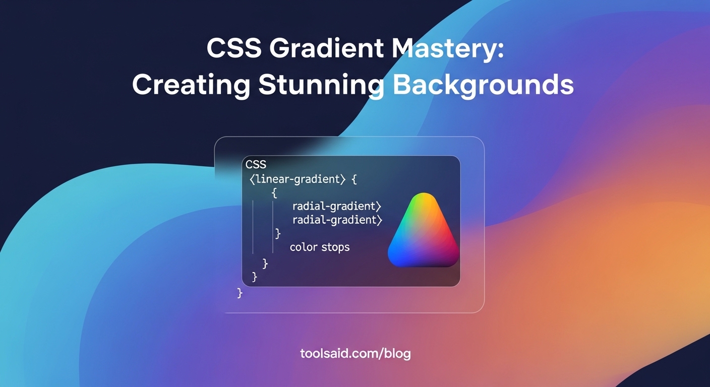
1. Understanding the Gradient Types 📐
A. Linear Gradients (The Industry Standard)
The most common type, where colors transition along a straight line.
✅ Use subtle angles like 135deg or to bottom right for a more modern look than standard vertical gradients.
❌ Don’t rely on default to bottom gradients as they often look dated.
/* Professional subtle blue gradient */
background: linear-gradient(135deg, #667eea 0%, #764ba2 100%);
B. Radial Gradients (The Spotlight Effect)
Colors radiate from a single point, perfect for “glow” effects behind products or text.
background: radial-gradient(circle at center, #ffffff 0%, #e2e8f0 100%);
C. Conic Gradients (The Rotation)
Perfect for pie charts, color wheels, and unique border effects.
background: conic-gradient(from 0deg, red, yellow, green, blue, red);
2. Professional Design Guidelines ✅/❌
A bad gradient can make a site look “cheap” or “amateur.” Follow these industry standards:
✅ Near-Color Transitions: Transition between colors that are close on the color wheel (e.g., Deep Blue to Sky Blue). It looks natural and premium. ❌ Opposed Colors: Transitioning between diametrically opposed colors (e.g., Red to Green) without a middle stop creates a “muddy” gray area.
Layering for Depth
Stacking multiple gradients is a pro technique for achieving that sophisticated “mesh” look.
💡 Tool Alert: Don’t guess your colors. Use our Gradient Generator to visually build and copy cross-browser code.
3. Performance & SEO Benefits 🚀
Why use CSS instead of a high-quality .jpg?
- Microscopic File Size: A CSS line is bytes; a background image is often 200KB+.
- Resolution Independence: CSS gradients never pixelate, even on 8K monitors.
- Dynamic Control: You can change colors instantly with JavaScript.
4. Advanced: The Mesh Gradient Trend ✨
One of the hottest trends in UI/UX is the Mesh Gradient. You can achieve this by stacking multiple radial-gradient layers.
.mesh {
  background:
    radial-gradient(at 0% 0%, rgba(102, 126, 234, 0.5) 0px, transparent 50%),
    radial-gradient(at 100% 0%, rgba(118, 75, 162, 0.5) 0px, transparent 50%),
    radial-gradient(at 100% 100%, rgba(240, 147, 251, 0.5) 0px, transparent 50%),
    radial-gradient(at 0% 100%, rgba(245, 87, 108, 0.5) 0px, transparent 50%);
}
5. FAQ: CSS Gradients 🙋♂️
Can I animate a CSS gradient?
Direct animation of background is limited, but you can animate background-position or use a larger background-size to create a “panning” effect.
Does it work in all browsers?
Yes. All modern browsers (Chrome, Firefox, Safari, Edge) have supported standard CSS3 gradients for over a decade.
Conclusion: The Future of Dynamic Design
CSS Gradients are the bridge between simple, functional layouts and truly “wow-factor” visual experiences. By mastering the balance of color harmony and transparency, you can create performance-optimized sites that look and feel premium on every screen.
Ready to design? Start building your next masterpiece with our CSS Gradient Generator!
